
-- Helping You Get The Most Out of Your Website --
November SiteSpinner® WebTips
We're Back!
SiteSpinner WebTips has been off-line for a while. We've been quite busy getting new updates to SiteSpinner and SiteSpinner Pro out the door. Fear not however, we're back now with more great stuff to help get your website designed, published, and noticed.
In this month's SiteSpinner WebTips, under Design we'll talk about some basic ideas around making your site more accessible. In How-To, we talk a bit about basic Mobile design. In Community Tips, Andrew tells us how to check the readability of your website, and for Site of the Month, James and Janae Get Married! Lastly, for those of you who may have missed it, we have posted an update to SiteSpinner Pro. Get the latest SiteSpinner Pro Now!
In this issue:
- Design - Making your web site more accessible
- How To - Creating a Mobile Design with SiteSpinner Pro
- Community Tips - Readability - how easy is your website to read?
- Site of the Month - James and Janae Get Married!
- Special Offers and Announcements - SiteSpinner Pro Update
Design - Simple Ideas for Making Your Website More Accessible
_________________________________________________________________
Making your website accessible means thinking about your audience, and how they view your site. There are many factors involved in making a website accessible, such as:
Viewing Device
Different devices, such as desktop computers, cell phones, smart phones, etc. display Websites differently. Many mobile devices, such as the iPhone, attempt to display a standard website within a small viewing area. It is always best to create a separate layout for the device you are targeting. SiteSpinner Pro allows you to view your mobile website pages within the work-window using the popular mobile browser; Opera.
Web Browsers
There are many different web browsers to choose from. As much as these browsers claim to conform to the same standards, the reality is that all the browsers treat your web pages slightly differently. It is always best to test your page on as many browsers as possible.
Optimizing Images
Even in this day and age not everyone has broadband access to the Internet, many people are still on dial-up. Also, with more and more people using their mobile devices to access the web, these devices may carry a surcharge for the additional bandwidth. Your best bet is to ensure that your images are optimized as much as possible. That means making the file size as small as possible without affecting the quality of the image. Remember, if your page is slow to load, people may leave. Also, ensure that all your images have Alt/Title text. This is the text that is displayed where an image is before it loads, and when you put your mouse over the image. SiteSpinner and SiteSpinner Pro use the Title field located in the Link Editor to achieve this.
Language
Not everyone speaks English, and not everyone speaks the same English. Once you have written your text, try reading out loud, that is good way to find mistakes. Check out the User Tips further in this newsletter for some other insights.
Display Settings
Remember, just because you have a huge monitor, set to a really high resolution, does not mean your visitors do. If you are designing for the desktop, you might want to design for the lowest common denominator (typically 800/600). If you want to target other devices, again, it is best to design a separate layout for that device when you can.
Color Schemes
Are you color blind? Your visitor may be. Even if they are not, their monitor or mobile device might have a problem with some colors over others. Read more about how to color your site.
Web-Safe Font Selection
We have explored web-safe Font selection in a previous SiteSpinner WebTips issue. In a nutshell, be sure to use a Web Safe Font for your text. If you are using SiteSpinner, SiteSpinner Pro, or WebDwarf, Web Safe fonts have a 'WS' next to them (WS stands for Web Safe). Not all visitors to your site have the same fonts on their system that you do. If you use a non web safe font, and your visitor does not have that font on their system, a different font will be used, with potentially bad consequences for your design.
How To - Mobile Websites with SiteSpinner Pro - An Introduction
_________________________________________________________________
Is your website accessible to the masses? 40 million Americans are now active monthly users of the mobile Internet via SmartPhones and mobile browsers. And there are more mobile users outside the US.
SiteSpinner Pro is the only website tool designed to enable you to create standard Websites along with mobile Websites. That means you can create a standard website under one tab in the SiteSpinner Pro work window, and then switch to the next tab and design a mobile-friendly layout. Once you are done you only need to publish both layouts as single page.
Your visitors' browser will automatically determine which layout to use. If they are on a desktop/laptop, your standard layout will be displayed. If they are on a mobile device, your mobile layout will be displayed.
How easy is it to create separate Mobile layout in with SiteSpinner Pro? - Really easy. When you create a new Project in SiteSpinner Pro, the Layout dialog comes up.
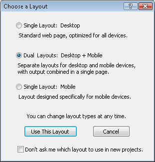
Single Layout: Desktop
Build your website how you would normally. SiteSpinner Pro optimizes the code so that it is browser-friendly for standard desktop/laptop browsers. By default, SiteSpinner Pro also optimizes for mobile devices that display standard webpages, such as the iPhone, etc.
Dual Layouts: Desktop + Mobile
This is where the power of SiteSpinner Pro's mobile development capabilities come in. Design your standard site under the desktop tab. Now switch to the mobile layout and design for a mobile device. If you pick the resolution of the iPhone, then whenever someone visits your page, that layout will be used. This ensures that the visitor sees exactly what you designed - no zooming necessary.
Single Layout: Mobile
Say you already have a standard website, but want to add a Mobile site to go with it. With the mobile layout you can design mobile friendly, low bandwidth sites. What's more, you can design different sites for different devices. If you want a site targeted for iPhone users, and another for small screen cell phones, no problem, just drag and drop.
Preview
With the Opera browser built-in, all you have to do is click the Preview tab in the SiteSpinner Pro work-window and you will see exactly what your site looks like at any resolution. Meaning you can see what your layout will look like on a standard desktop/laptop browser, as well as what it will look like on mobile devices.
Easy, now anyone can create mobile Websites.
Community Tips - "Readability - How easy is your content to read"
_________________________________________________________________
These Tips are created by readers and SiteSpinner users and posted to the Virtual Mechanics Community Forums
Andrew writes "Are you writing for The Wall St Journal or a supermarket tabloid?" continue reading...
_________________________________________________________________
These Tips are created by readers and SiteSpinner users and posted to the Virtual Mechanics Community Forums
Andrew writes "Are you writing for The Wall St Journal or a supermarket tabloid?" continue reading...
It seems that SiteSpinner Pro makes people want to get married. What can we say, using SiteSpinner Pro just brings out the love in people...
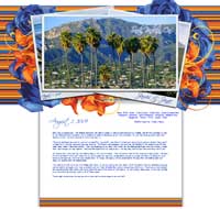
Site Title: James and Janae Get Married
Site Author: Janae Hester
Site Link: www.jhgraphix.com/jamesandjanae.html
Site Description: As we prepared for our marriage on August 1, 2009, we noted that we had several family members and friends that we did not invite who still wished to be part of the big day. So, we decided to create a website that showcased not only the photo album post-wedding, but featured
all the planning and ideas that went into the wedding day prior to. It served as a way to keep the family involved and was a fantastic photo album for everyone who couldn't share our special day with us.
Built With: SiteSpinner Pro
Review: I love SiteSpinner Pro! It gave me my start as a Web Designer and Developer and without it I may not have had the opportunity to become the freelance designer that I am today!
Built With: SiteSpinner Pro
Review: I love SiteSpinner Pro! It gave me my start as a Web Designer and Developer and without it I may not have had the opportunity to become the freelance designer that I am today!
If you haven't already heard the news, we have a new release of SiteSpinner Pro. As well as a number of new features, this release enables you to choose from 3 types of layouts for your projects - Web, Web+Mobile, or Mobile.
Registered SiteSpinner and Print Shop Web Designer Customers:
For a limited time Registered users of SiteSpinner and The Print Shop Web Designer can upgrade to SiteSpinner Pro for 50% Off (49.50 US). Simply reply to this email and include your Serial Number (available in the software under Help > About).
Registered SiteSpinner Pro Customers: For Registered users of Virtual Mechanics SiteSpinner Pro this is a Free Upgrade - see the Information on updating your software.
Download: Download the free trial of SiteSpinner Pro.
Download: Download the free trial of SiteSpinner Pro.
_________________________________________________________________
Don't Forget to Forward This Newsletter To Your Friends!
J. Peter WhiteDon't Forget to Forward This Newsletter To Your Friends!
President,
Virtual Mechanics Inc.
< Celebrating over 10 years in business - 1998 - 2009! >

Virtual Mechanics Home | On-line Store | Products | Privacy Policy
ISSN 1488-7088. TM ® & © 1998 - 2009 Virtual Mechanics Inc. All rights reserved.
ISSN 1488-7088. TM ® & © 1998 - 2009 Virtual Mechanics Inc. All rights reserved.